

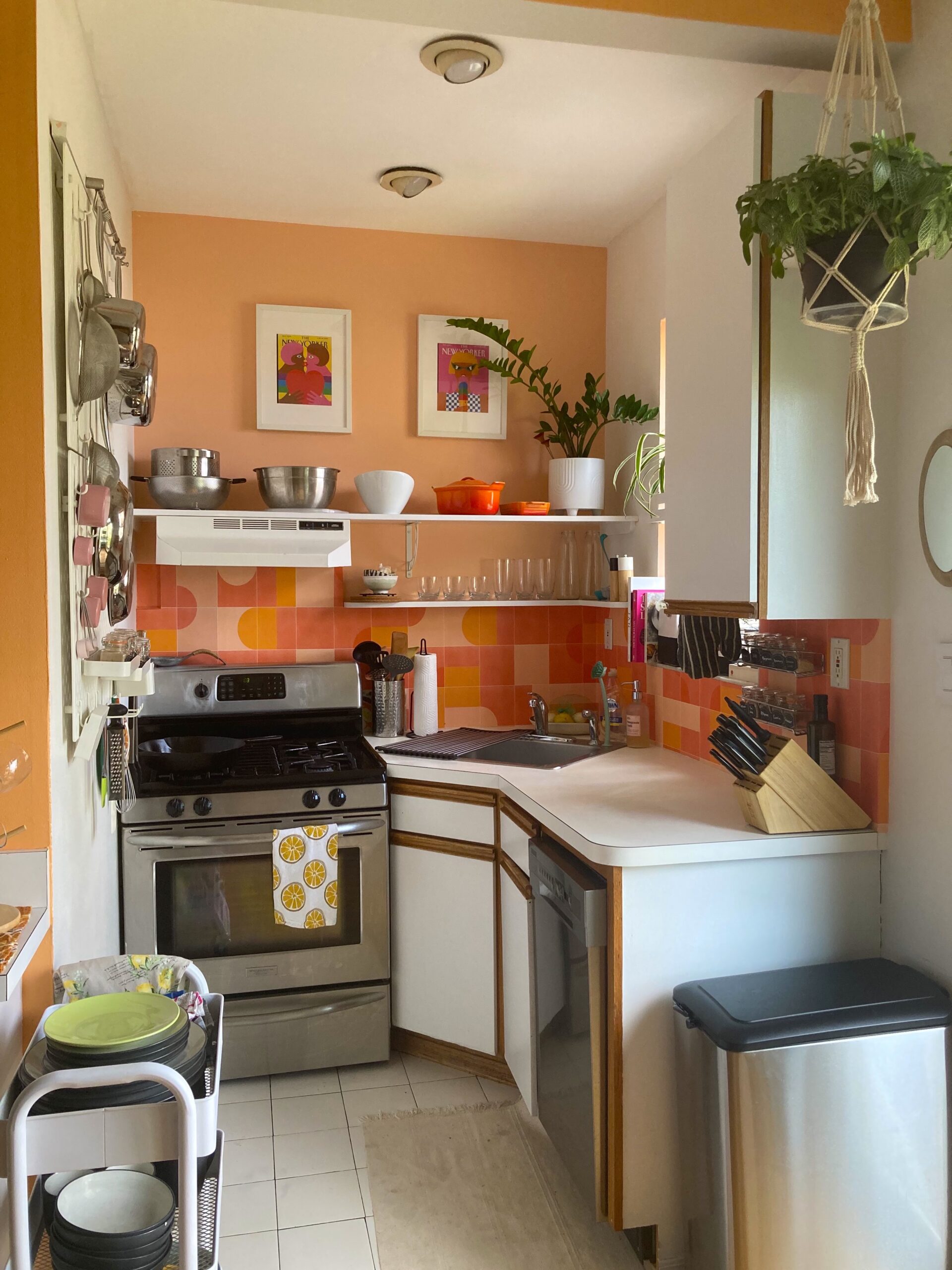
The itty-bitty corner kitchen with a single drawer and 80’s melamine cabinets had gone from the most dated room in my apartment to my new favorite place. I painted one wall a peachy pink and added an extra pop of paint in the interior window frame. Next came a fake backsplash of dancing pink and orange half circles and squares, which cartwheeled behind a mix of stout and tall clear cups into a dizzying funhouse. The bright pink measuring cups and light pink measuring spoons dangling from individual hooks look miniature next to silvered pots and pans on the sleek white Ikea pegboard. Then of course, there are the plants – a playful waxy-leafed ZZ pirouetting in a bright white pot, a spider plant basking above the sunny window, fat strings of pearls cascading onto the chalkboard containers labeled “flour” and “sugar” in jaunty white letters. Matching spice jars with orange lids are lined up across the counter in a congo line, calling “pick me!” Though I am not the cook in my household, I often find myself idling in the kitchen, admiring the view. Put simply, this room brings me joy.
Science supports my anecdotal love for my tiny pink kitchen. The book Joyful by Ingrid Fetell Lee Lee codifies ten universal aesthetics of joy, the first of which is “energy,” or the use of light and vibrant color. Lee highlights the power of color in the city of Tirana, Albania, a former communist city that was struggling politically and financially after the collapse of the USSR. In 2000, artist Edi Rama was elected mayor and launched an ambitious project to paint buildings in his dying city in playful shades like yellow, teal, and orange. This seemingly artificial update had astounding impacts: residents reported feeling safer and the city saw a significant decrease in crime. Similarly, the non-profit Publicolor has painted 323 New York schoolsin bright colors, increasing attendance and decreasing the rate of dropout compared to the gray schools around them. Color is more than an aesthetic: it has the power to influence our mood and behavior.
During COVID, “dopamine dressing” exploded, with style influencers dressing in vivid hues to boost their moods and bring them a daily pick-me-up. It wasn’t long before the trend moved into the home decor space, with loud patterned wallpapers, green velvet couches, and pink scalloped doorways filling my Tiktok and Instagram feeds.
In a time of mass isolation and uncertainty, we all needed a little boost. Raymond Boozer, Principal Designer of Apartment48 and “color guru” told House Beautiful in an interview that “color is the least expensive way to experiment with design.” While you probably aren’t buying new furniture yearly, paint is relatively inexpensive and flexible. One gallon of paint can cover about 400 square feet – the size of many small New York apartments.
 It’s taken time to build my confidence around color. A Pinterest board for my first “adult” apartment reveals a bleached palette of unfinished pine, bohemian textured cream linens, gold accents, and white-washed brick. I was confident with mixing textures, but as the daughter of a born-and-bred New Yorker, color was not in my repertoire. While my wardrobe still veers towards the New York uniform (black-on-black-on-black), color has slowly seeped into my apartments: a pink and orange rug, cheery patterned throw pillows, a blue accent wall.
My fear of color is not a coincidence: David Batchelor argues in his book Chromophobia that color has been weaponized in Western culture, with color being associated with the other – “the feminine, the oriental, the primitive, the infantile, the vulgar, the queer or the pathological.” Color has been relegated to the realm of superficiality and artifice, a contamination to be avoided by sophisticated and professional adults.
At a more practical level, color can be intimidating because it seems easy to get wrong. It’s true that some risk-taking and patience are required when working with color. As every blog and designer will tell you, the best way to avoid a color misfire is to swatch a large square in your room and live with it for a few days before committing. Anyone who has skipped this step (me) can tell you that a color you love on a swatch may look completely different on the wall (in my first apartment, I accidentally painted a room I-just-had-a-baby-boy blue.)
Since my landlord hired someone to paint our apartment before we moved in, I had no opportunity to swatch pink paint in my kitchen. I did everything in my power to mitigate disaster: I matched the paint samples to my backsplash, I monitored the palette in a room with north-facing windows (the same light conditions as our new kitchen) at several points throughout the day, and knowing that paint always looks darker on the wall, I went one shade lighter than my selection. I paired the pink with Benjamin Moore’s White Dove, a flexible true white that wouldn’t clash or influence the hue. I sent our choice to my landlord, crossed my fingers, and prayed to the interior design gods.
The color ended up being the perfect shade, but on all three walls, I felt a bit like James in the Giant Peach. Ultimately, I decided to spend a few extra hours repainting two walls white, leaving just a pink accent wall and the pink window frame. Despite the few hours and $20 worth of supplies it took to fix my pink-plosion, I have no regrets about my big swing.
Color psychology posits some trends about what colors inspire different feelings in people, though empirical studies in the field have been limited. Personal experiences and memories make universal associations difficult. Culture makes a big difference in what colors invoke – for example, red, which is seen as an aggressive or violent color in Western culture, is the color of luck and happiness in much of Central Asia.
According to a study in the Journal of Environmental Psychology, people far from the equator tend to associate yellow with happiness. In the United States, 60-70% of people associate yellow with happiness, and in Finland, the number jumps to 88%. However, people closer to the equator are less likely to make that connection, with only 5.7% of Egyptians finding that yellow invoked feelings of joy. This variation means that it’s safer to choose colors based on how they make you feel as opposed to trying to select them based on pop-science. There are also a lot fewer rules than people want you to believe. As famous designer David Hicks once said, “colors don’t clash, they vibrate.”
Already, “dopamine dressing” as a trend is leaving the mainstream, but for me, it’s more than a passing phase. I just painted my dining room tangerine, reupholstered some wooden spindle chairs in orange vinyl, and put a 4×4 foot piece of 1970’s “carpet art” above my fireplace that was salvaged from a neighbor’s basement. I must admit, I’m feeling happier already.